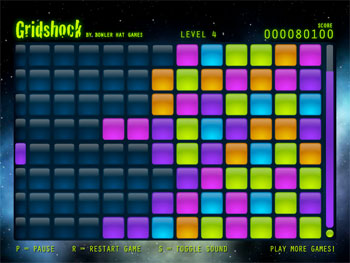
Another creation from my indie game venture, Bowler Hat Games, has been released into the wild. It goes by the name Gridshock, and I see it as a bit of a combination between a couple classic puzzle games, Tetris and Collapse!. It’s a lot less of a thinker than my previous game, Chroma Circuit, but I wanted to aim at a more casual market this time. That said, I think everyone can enjoy Gridshock.

Development for Gridshock went a lot faster than with Chroma Circuit. I completed Chroma Circuit in a bit over a month, while it took me only three weeks to finish Gridshock. I think this happened for a few reasons.
-
Chroma Circuit was the very first game I built in Flash, and I spent a lot of time finding the right way to structure my projects, balance development vs. design time, and really had too strong a focus on various “administrative” things. I was able to jump into Gridshock pretty quickly because I had become very comfortable with that stuff by the end of Chroma Circuit’s development, and they moved more into the background.
-
I did most of my visual design work for Gridshock in Flash CS4. Chroma Circuit had some very specific geometric requirements that needed a lot of programmatic drawing. I tried the visual drawing approach at first, but the in-game objects simply wouldn’t fit together properly with the tiny variations made by creating the art by hand, so I had to scrap a couple early attempts and do it all the mathematical way. For Gridshock, a vast majority of the art was finished in only a couple of days, and I focused much more on programming game mechanics than programming graphics.
-
Content creation for Gridshock was much easier. Chroma Circuit had levels that needed to be designed, and I didn’t put together my Flex-based level editor until the very end (for use if I make a followup). Gridshock has a fixed playing area that doesn’t change as the game progresses. I had to focus on making the same basic play area more replayable rather than using variety like I had in the previous game.
Early prototypes for Gridshock varied quite a bit from the final product. When the initial idea for the game popped into my head, I imagined activating lights on the board from four different directions. Unfortunately, the pace of the game ended up being pretty slow, and clearing the board was absolutely trivial. There was no good way to add new rows to speed it up, so I had to rework my idea a bit. The second variation simplified gameplay to activating lights from the left and the right sides of the board, with lights settling in the middle rather than on the right edge, as in the final version. I found it was too difficult to move back and forth to both sides of the grid. When I simplified the board one last time, I also added the timer on the right that pushes a new row on the bottom. This quickly proved to be the most fun and playable version of the game.
I made another modification with my final prototype worth mentioning. It allowed players to click anywhere on the row to activate a light. In the first builds, the smaller lights on the left side that indicate color were buttons instead. Expanding the clickable area to the entire row made for fewer player mistakes, and a bit of a faster pace. Interestingly enough, this change may actually make it easier for a bi-directional version of Gridshock to be possible again, since the mouse movement won’t be as fatiguing as when I tried it the first time. I’ll certainly consider it if I make a sequel. I have other interesting ideas for board layout that may be more interesting, though.
Please go take a look at Gridshock. It’s a fun little puzzle game that’ll help you waste a few minutes of your morning or afternoon. If you haven’t played any of my games yet, I encourage you to check out Chroma Circuit too. That one’s a bit more cerebral and deliberate. I also recently finished development of my third game, called Qrossfire. It’s another casual puzzle game, and I’m pretty proud of the way it turned out. The graphics, in particular, really pop. Qrossfire will be out once I find a sponsor. If you’re a developer with an account over on FlashGameLicense, go take a look and give it a rating (thanks!). This week, I’m deep in brainstorming stage for the game I want to build next. I’m planning to branch out from the puzzle game genre, now that I’ve gotten more comfortable after finishing a few games, and I’m pretty excited. Stay tuned for more from Bowler Hat Games!