As a game developer, I try to be accommodating to all types of players. One thing I learned pretty quickly after I released my first web game, Chroma Circuit, is that choosing colors (especially in puzzle games) is very important and not a task to take lightly. Color blindness can easily make two colors that seem very different to me look almost indistinguishable to others. When gameplay only relies on being able to see the difference between colors, you’ve got a problem.
As soon as I received the first request from a color blind user who was having some trouble with Chroma Circuit, I realized my mistake in simply choosing an aesthetic mix of colors that looked good to my own eyes. Only a couple of the colors seemed similar to the color blind player, but those were enough to take all the fun out of the game, and to make it mostly unplayable. Right away, I started putting together a new palette for Chroma Circuit. I’m no expert in this area, but I do have some tools at my disposal that certainly helped me out.
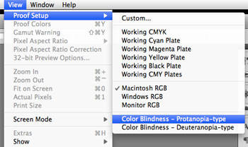
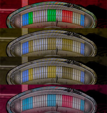
I think the first thing I did was take screenshots of a few levels from Chroma Circuit to load into Photoshop. Under the View menu, go to the Proof Setup sub-menu. This section lets you preview how your image will look in different color modes. For instance, designers can try CMYK to see how something might look a little different in print. You’ll find two options relevent to color blindness here, Color Blindness — Protanopia-type and Color Blindness — Deuteranopia-type.
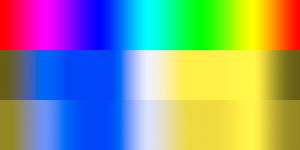
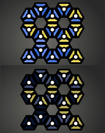
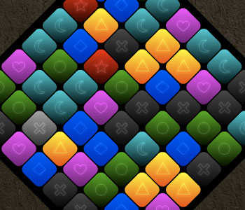
A standard spectrum of hues is shown above. Each of the color blindness proof options is shown for comparison. If you have a moment, and want some more examples, grab screenshots of your favorite websites that use an interesting mix of colors, paste into Photoshop, and take a look at how they change for color blind visitors. Below, you can see Chroma Circuit through the eyes of someone with Deuteranopia-type color blindness. The top half displays a level with the original colors, and the bottom half shows the same level after I made changes to the palette.
To address the issue with Chroma Circuit, I took a pretty basic approach. I bumped up the contrast among each level’s colors as high as I could so that players could rely on brightness, in addition to hue. I generated the brightness levels based on the number of colors appearing in the level to achieve maximum contrast. If there were four colors required, I might set brightness values to 20%, 40%, 60%, and 80% brightness. If there were only three color needed, I would use 20%, 50% and 80%. The resulting colors weren’t particularly pretty, but they seemed to work well enough for the players who thanked me after I made the change (accessible in the Settings screen).
When I brought Chroma Circuit to mobile devices, I decided to take a different approach based on a suggestion from a color-blind player. Rather than creating a palette of high-contrast colors, I decided to augment my regular palette with a set of unique patterns for each color, if “Pattern Mode” is enabled.
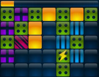
With Qrossfire, another puzzle game I made, I tried adding something directly to the game, rather than making players enable it from the settings screen. In addition to colors, I created a set of visually unique symbols to display on the game board.
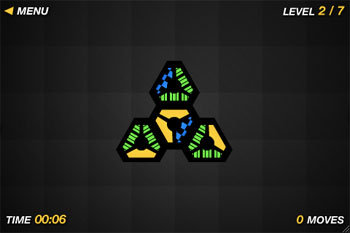
In my most recent mobile game, Gridshock, I went back to making the patterns an option. Still, I feel like I integrated the patterns into the overall design better because I often “forgot” that I had the patterns enabled while testing. Additionally, Gridshock provided a new challenge that I think may have actually helped me design the patterns better. Since the timer bar shows the current color, and it’s a different shape than the squarish blocks in the grid, I had to ensure that the patterns were bold and flexible enough to display within differently-sized regions.
More Real-World Examples
Let’s take a look at some other games out there, including popular commercial titles to see how they handle (or mishandle) colors.
As I was writing this post, I was lucky to came across some complaints about BioShock 2, an example of a big commercial game that isn’t friendly with colors. Negative Gamer shows us What BioShock 2’s Hacking Looks Like if You’re Colour Blind.
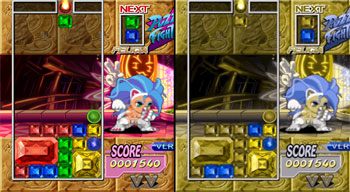
Ars Technica had an article about the developers being unaware of color blindness a couple years ago. It includes the Puzzle Fighter screenshot comparison above, and many other examples described in the text, including first-person shooters, platformers, and more. Notably, New Super Mario Bros. doesn’t provide enough visual cues to easily tell the difference between Mario and Luigi.
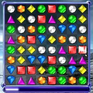
In Bejeweled, each gem not only has a different color, but a different shape as well. These shapes are integrated into the design, and they’re always on by default. Instantly playable by color blind gamers!
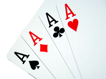
I know, I know, it’s not a video game, but standard playing cards are an excellent example of game pieces that can be used by color blind players. Though card games often rely on the difference between red and black suits, color blind players shouldn’t have a problem with that. You might have never noticed, but both red symbols (hearts and diamonds) come to a point at the bottom while the black symbols (spades and clubs) have that little flat handle. Moreover, the contrast between red and black should be more than enough to allow players to note the difference, even if red looks a little more brown or yellow to them.
Don’t ruin the fun!
We all hate when players to stop having fun in our games for any reason. Though we might not be able to make changes to support all disabilities, ones like color blindness are often very simple to address, and I think it’s worth the small amount of effort required. One needs not ruin the aesthetic experience to make it happen either. If you can integrate various helpful tweaks into your main design, great, but a simple setting that can be enabled only when needed can be an acceptable alternative. Don’t forget that Photoshop provides tools that can be a big help in the process.
If you can, try to remember color blindness early in the design process, so that you don’t have to spend time changing an existing design that you might already be happy with. Not only will it save you frustration, but it might allow you to find better solutions that might not be acceptable later in the process.
Pingback: somerandomdude: Addressing color blindness in game design http://joshblog.net/2010/02/18/addressing-color-blindness-in-game-design/ — Some Random Dude
I’ve written an AIR app for simulating color blindness on swf (and a filter for use in any Flash development).
Hope it helps 🙂
Hi Josh,
This is the first time I come to your blog, I’m really impressive in this article. Really good work.
Thanks for sharing this experience.
Thanks for this,
Only recently became aware of the substantial number of people who are colour blind and gamers. Will be taking this into account for all my future developments.
You gave the example of how bejeweled can be played easily by the colorblind. The main symbols are not a problem, the designers thought about them, it’s the multipliers in bejeweled which are only identifiable by color which are the problem! Seems the developers didn’t think it through beyond the main shapes!
Actually, Bejeweled can still be somewhat challenging to the color deficient. The six-sided orange and eight-sided green jewels are both round enough that I have trouble distinguishing them at a quick glance. The 3D shading does not help matters.
And don’t get me started on Bejeweled Blitz on Facebook! Blitz includes important “multiplier” gems, all of which are round and are only distinguishable by a thin band of color.
I run photoshop CS3, and alas, I do not have the colour blindness choices in the view proof menu. What version do you use?
thanks for this, btw, it was really interesting
Sharon, it looks like that feature was added in CS4. I thought it had been around longer, but I guess my memory is wrong on that one.
My friend is disqualified from the graphic arts industry, which did not enable him to even work on a printing press. Printers have to take a color blindness test for even an entry level job.
Pingback: My feature wishlist for (PC) games « Take my advice, I don't use it anyway…
I sometimes play bio shock and I have trouble hacking because the green and yellow look very similar because I am colour blind red and green (colour blindness) but it affects most colours I was just wonder is there a colour blind setting for it ?
matthew, I don’t think it has a setting. However, that’s not a game that I’ve played myself, so I don’t know for sure. I was merely linking to the article since it was relevant.
Pingback: PC Gaming Feature Wishlist | The Gamerverse
I was Googling what jobs would be good for me with colorblindness and came across your joshhblog. I was interested in Electrical Engineering Technology but what I’ve been reading, I would have difficulty in that career choice. I suppose I’d have difficulty in the gaming as well. For example, yes, in Bejeweled I use the shapes. One challenge in that game, the green circles look practically the same to the orange hexagon type shapes when I’m trying to do the game quickly. I’m wondering what great jobs I can do with having colorblindness. In all your research and chatting with people, any ideas of how I could use my colorblindness as an advantage in a career choice? Thanks for the great information. I can hardly wait to try out the Chroma Circuit game.